Ece Erke/Data Analyst

Data Portfolio

My Orange Theory Stats

Tracked and analyzed personal Orangetheory workout data to uncover fitness trends and performance insights.

Goal

Tracked and analyzed personal Orangetheory workout data to uncover fitness trends and performance insights.

Tools & Techniques

Excel (data entry), R (data cleaning, processing, analysis), Power BI & Tableau (data visualization).

Project Type

Data cleaning, analysis, visualization, and actionable insights.

This dashboard presents an in-depth look at my workout data from Orange Theory, covering various performance metrics and trends over two years. It aims to analyze patterns and provide insights into areas where I can enhance my fitness journey. Additionally, a calorie burn calculator has been developed to estimate calories burned based on key workout metrics.

Goal

The goal of this analysis is to explore trends in my workout data over the past two years, identifying opportunities to improve my performance and focus on specific areas for greater results. Additionally, a calorie burn calculator has been created to estimate calories burned based on key workout metrics.

Data

I tracked and manually entered all data into Google Sheets, utilizing data validation to ensure accuracy. The data is divided into three distinct sheets: general stats, rower, and treadmill, each containing relevant workout metrics.

Approaches Used

Data Tracking and Entry (Google Sheets)

Linear and Multivariate Regression Analyses, Data Merging (R)

Data Visualization (Power BI & Tableau)

Quick Navigation

(Click on a section to jump directly to it!)

Overall Performance Overview

Statistically Significant Correlations

Heart Rate Zones Breakdown

Splat Goal

Rower/Tread Overview

Rower vs. Treadmill Stats

Creating a Calorie Burn Calculator - Step by step instructions on creating a calculator on Tableau using a prediction model created in R.

Estimated Calorie Burn Calculator

Final Insights

Overall Performance Overview

Class Attendance Breakdown

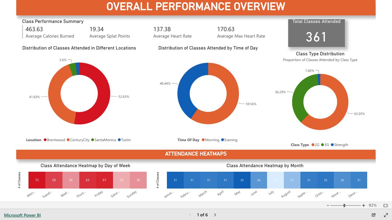
Brentwood was my most-visited studio, followed closely by Century City, with occasional classes in Santa Monica and Tustin.

Morning vs. Evening Workouts

60% of my classes were in the morning, while 40% were in the evening.

Class Format Preferences

2G classes (tread + floor) made up 62% of my workouts, followed by 3G classes (tread + rower + floor) at 36%.

Strength-only classes accounted for just 2%.

Attendance Trends

Weekly Patterns

Monday and Friday were my most attended days, while Saturday was the least, followed by Sunday and Wednesday.

Monthly Trends

May had the highest attendance, followed closely by October. July was the least active month.

Statistically Significant Correlations

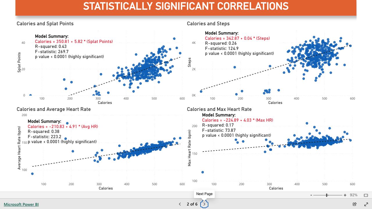
All models showed a positive correlation between calories burned and the compared variables, with varying strengths.

Splat Points had the strongest correlation with calories burned (R² = 0.43), indicating that higher time spent in the orange/red zones led to greater calorie expenditure.

Average Heart Rate followed closely (R² = 0.38), suggesting that maintaining a higher sustained HR significantly impacts calorie burn.

Steps showed a moderate correlation (R² = 0.26), meaning more movement generally led to higher calorie burn, though not as strongly as heart rate metrics.

Max Heart Rate had the weakest correlation (R² = 0.17), implying that peak HR spikes alone are less predictive of total calories burned compared to sustained exertion.

Each model was highly significant, reinforcing the relationship between effort intensity and calorie expenditure.

Heart Rate Zones Breakdown

Class Type & HR Zone Distribution

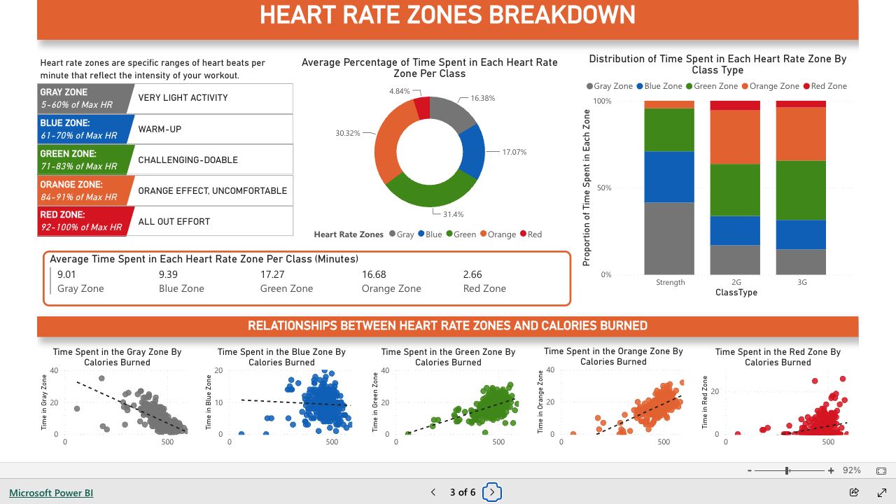
Strength classes had minimal time in the orange zone and no time in the red zone, emphasizing lower-intensity effort.

2G and 3G classes had a similar distribution, with most time spent in the green and orange zones, and a small portion in the red zone, indicating consistent moderate-to-high intensity training.

Calories Burned vs. Time in HR Zones

Gray Zone (Very Low Intensity) – Strong negative correlation; more time here resulted in fewer calories burned.

Blue Zone (Low Intensity) – Slight negative correlation, reinforcing that minimal exertion leads to lower calorie burn.

Green Zone (Moderate Intensity) – Positive correlation; time spent here contributed to steady calorie expenditure.

Orange Zone (High Intensity) – Slightly stronger positive correlation than green, aligning with the goal of maximizing calorie burn.

Red Zone (Max Effort) – Somewhat positive correlation, though its impact on total calories burned was less pronounced than time spent in the orange zone.

These trends highlight that while high-intensity efforts contribute to calorie burn, sustained moderate-to-high intensity (green and orange zones) is the most effective for maximizing energy expenditure.

Splat Goal & Performance Impact

Heart Rate Zone Distribution by Splat Goal

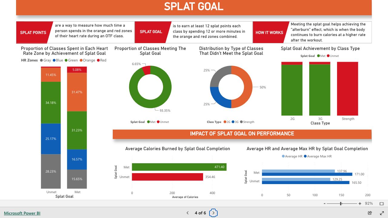
Classes that met the splat goal spent significantly more time in the orange and red zones, indicating higher-intensity effort.

Classes that did not meet the splat goal had a greater proportion of time in lower-intensity zones (gray and blue), reflecting less time in peak exertion.

Splat Goal Achievement Trends

I achieved the splat goal in 93% of all classes, showing strong consistency in hitting the afterburn effect.

Half of the classes that didn’t meet the splat goal were 2G, though this may be influenced by attending more of them overall. However, strength classes had a disproportionately high rate of unmet splat goals, despite being my least attended class type.

No strength classes achieved the splat goal, suggesting that their focus is different, while nearly all 2G and 3G classes met the goal.

Performance Impact of Meeting the Splat Goal

Calories Burned: Classes where I met the splat goal burned significantly more calories.

Heart Rate: Achieving the splat goal resulted in a higher average and max heart rate, reinforcing that more intense effort leads to greater cardiovascular engagement.

These findings highlight the effectiveness of reaching the splat goal for maximizing calorie burn and overall workout intensity.

Treadmill & Rower Overview

Treadmill Performance Insights

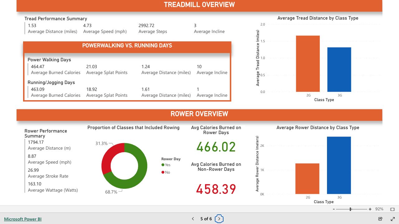
Power Walking vs. Running/Jogging: Despite similar calorie burn, power walking days averaged more splat points, suggesting it may be more effective for achieving the afterburn effect.

Class Format Impact: Tread distance was higher in 2G classes compared to 3G, which aligns with 2G classes dedicating more time to treadmill workouts.

Rower Performance Insights

Rowing Frequency: 69% of classes included rowing, while the rest did not.

Calories Burned: Rowing days had slightly higher average calorie burn, though the difference was minimal.

Class Format Impact: 3G classes featured nearly twice as much rowing as 2G classes, which is expected due to the additional rower station in 3G workouts.

These insights highlight how workout format influences treadmill and rower engagement, with power walking showing potential advantages for splat points and 3G classes incorporating more rowing.

Treadmill vs. Rower:

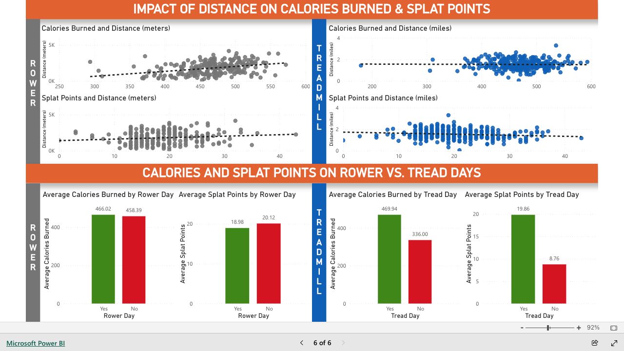
Rower: There’s a positive correlation between rowing distance and both calories burned and splat points, meaning the more you row, the more effort and burn you generate. However, whether it’s a designated rower day or not doesn’t significantly impact average calorie burn or splat points, suggesting rowing may not be the main driver of workout intensity on those days.

Treadmill: There’s a slight negative correlation between tread distance and both calories burned and splat points, indicating that higher effort—not longer distance—drives performance. However, treadmill days lead to significantly higher calorie burn and splat points overall, likely due to more intense intervals and structured effort on those days.

Key Takeaway:

Workout structure and effort distribution play a bigger role than just distance alone. Rowing effort scales with distance, but rower days don’t necessarily increase overall intensity. Meanwhile, treadmill workouts likely emphasize shorter, high-intensity bursts over long distances, leading to higher calorie burn and splat points on tread days.

Creating a Calorie Burn Calculator in Tableau

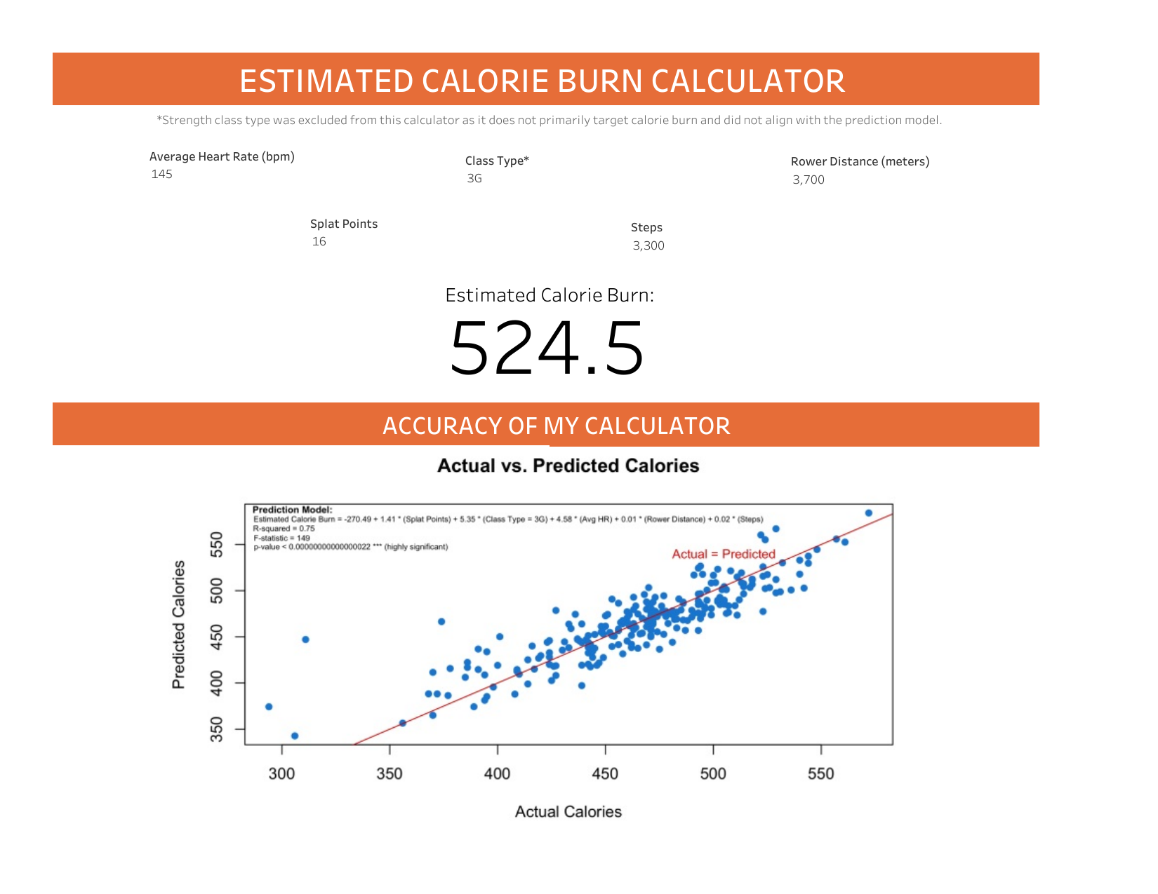
In this section I created a calorie burn calculator based on multiple factors, allowing me to estimate my calorie expenditure. To achieve this, I developed a multivariate regression model in R, which identifies how various workout metrics impact calorie burn.

Step 1: Building A Prediction Model in R

To begin, I created a multivariate regression model in R to analyze how different workout metrics impact calorie burn. I selected the variables that had the most statistically significant impact on calories and constituted the strongest model based on statistical evaluation. These variables include Splat Points, Class Type (excluding Strength), Average Heart Rate, Total Rower Distance, and Steps.

Using these factors, I built the following regression model:

prediction_model <- lm(Calories ~ SplatPoints + ClassType + AvgHR + TotalRowerDistance + Steps, data = OTStats)

This model forms the basis for our calorie burn calculator, allowing us to predict calorie expenditure based on user input.

Step 2: Setting Up Parameters in Tableau for User Input

To apply the regression model in Tableau, I created parameters that allow users to input their own workout data. Each parameter was carefully set based on a combination of realistic real-life values and observed data distributions to ensure meaningful and accurate predictions.

For numerical inputs like Splat Points, Average Heart Rate, Total Rower Distance, and Steps, I defined a data type of float or integer, set appropriate minimum and maximum values, and adjusted the step size to allow for smooth adjustments. These ranges were determined to align with typical workout data while maintaining flexibility for user input.

For Class Type, I created a categorical (string) parameter with a list of options, excluding Strength since it did not fit the model. Users can select between the remaining class types, ensuring the correct coefficient is applied in the calculation.

Step 3: Creating a Calculated Field in Tableau to Apply the Regression Formula

Once the parameters were set, I used them to create a calculated field that applies the regression formula, allowing Tableau to generate a predicted calorie burn based on user input.

Predicted Calorie Burn = -270.49 + 1.41 * [Splat Points] + 5.35 * IF [Class Type] = ‘3G’ THEN 1 ELSE 0 END + 4.58 * [Average Heart Rate (bpm)] + 0.01 * [Rower Distance (meters)] + 0.02 * [Steps]

Step 4: Designing an Interactive Dashboard to Display Predicted Calorie Burn Based on User Selected Input

In Tableau, I created a new worksheet and added the calculated field for predicted calorie burn to display the results as text. Then, I placed the parameters (Splat Points, Class Type, Average Heart Rate, Total Rower Distance, and Steps) as controls on the worksheet for user input. Numerical parameters were set as sliders, while Class Type was a dropdown list.

Next, I designed the dashboard view by adding the worksheet with predicted calories and positioning the parameter controls for easy interaction. I formatted the layout to be clean and intuitive, ensuring users could easily adjust values and view updated calorie predictions.

Step 5: Visualizing Model Accuracy

To assess how well our model predicts calorie burn, I created an Actual vs. Predicted Calories graph in R. This visualization helps us see whether our model aligns with real-world data. Ideally, if our model is accurate, the data points should closely follow the y = x line (Actual = Predicted).

Before entering the code, I first excluded missing data from the Total Rower Distance column and removed Strength class types from the dataset, as they didn’t align with the prediction model. This ensured the data used for the regression model was clean and relevant for predicting calorie burn.

OTStats_new <- OTStats[!is.na(OTStats$TotalRowerDistance),]

OTStats_new <- subset(OTStats, ClassType != “Strength”)

​Next, I used to following code to create a visualization:

predicted_calories <- predict(prediction_model)

plot(OTStats_new$Calories, predicted_calories, main = “Actual vs. Predicted Calories”, xlab = “Actual Calories”, ylab = “Predicted Calories”, pch = 16, col=“dodgerblue3”)

abline(0,1,col=“red3”)

text(x=505, y=540, labels=“Actual = Predicted”, cex=0.8, col=“red3”)

text(x=305, y=588, labels=“Prediction Model:”, cex=0.6, font =2)

text(x=405, y=577, labels=“Estimated Calorie Burn = -270.49 + 1.41 * (Splat Points) + 5.35 * (Class Type = 3G) + 4.58 * (Avg HR) + 0.01 * (Rower Distance) + 0.02 * (Steps)”, cex=0.5)

text(x=301, y=567, labels=“R-squared = 0.75”, cex=0.5)

text(x=300, y=557, labels=“F-statistic = 149”, cex=0.5)

text(x=332, y=547, labels=“p-value < 0.00000000000000022 *** (highly significant)”, cex=0.5)

Final Insights: Effort Over Distance

Rowing effort scales with distance, as seen in the positive correlation between rowing distance and both calories burned and splat points. However, since rower vs. non-rower days showed minimal differences in calorie burn (466 vs. 458) and splat points, rowing itself may not be the primary driver of workout intensity.

Treadmill workouts emphasize intensity over distance, shown by the slight negative correlation between tread distance and both calories burned and splat points. This suggests that shorter, high-intensity intervals, rather than simply running farther, are what drive performance.

Power walking generated more splat points than running, despite being lower impact. This suggests that effort (e.g., incline adjustments and heart rate response) can be more influential than just pace.

Workout structure matters more than just covering ground. The higher calorie burn and splat points on treadmill days suggest that effort distribution—whether through structured intervals or resistance changes—has a bigger impact than total distance traveled.