Ece Erke/Data Analyst

Data Portfolio

Real Estate Market Patterns

Analyzed housing and school rating data to identify potential growth areas for a private housing organization.

Goal

Analyzed housing and school rating data to identify potential growth areas for a private housing organization.

Tools & Techniques

R, data cleaning, data merging, sensitivity analysis, prediction models, exploratory analysis, k-means clustering, linear regression.

Project Type

Data cleaning, analysis, visualization, and actionable insights.

PDF REPORT

In this project that I completed as a part of an Exploratory Data Analysis and Visualization class at UCLA Extension, I explore real estate market patterns in 2019 in a specific city. Please refer to the full pdf report for the detailed data cleaning and merging process, as well as an in depth summary of the data.

Goal

A small, private housing organization is looking to expand on opportunities in new neighborhoods. Although the organization cannot disclose much about their project, they would still like an outside opinion on housing market patterns in certain neighborhoods. The goal of this project is to analyze a subset of their data and provide recommendations for areas of potential growth.

Data

Two datasets were provided by the housing organization; one containing data on selling prices of houses sold in 2019 in a specific city, and another dataset containing size and rating data for schools in the same city. Both datasets use pseudo names for variables such as neighborhood and school names.

Real Estate Market Patterns analysis visualization

Approaches Used

Data cleaning

Combining data using “merge”

Sensitivity Analysis

Prediction Models

Real Estate Market Patterns analysis visualization

Single imputation

Exploratory Analysis

K-means clustering

Linear regression

Sensitivity Analysis:

Real Estate Market Patterns analysis visualization

To see whether the list wise deletion would be an adequate method at handling missing data, I conducted a sensitivity analysis.

For the numerical variables that were missing data, being square footage, lot size, and levels, I created prediction models to fill in missing values. I ran correlations and the step function to determine which variables to include in my models. The variables I used in each prediction model are as follows:

Variables in the model to predict square footage: beds, levels, sold price, and type

Real Estate Market Patterns analysis visualization

Variables in the model to predict lot size: square footage, sold price, and type

Variables in the model to predict levels: beds, square footage, and type

For the categorical variables that were missing data, being cooling, heating, and fireplace, I used single imputation to fill in the missing values. I started by creating a table to observe the frequency of the variable levels within the dataset. We can see from the frequency table that 67% of the non-missing observations in the cooling variable, 78% of the non-missing observations in the heating variable, and 68% of the non-missing observations in the fireplace variable were “No”.

Given that the possibility of the missing values in any of these categorical variables was more likely to be a “No”, I decided to fill all the missing data in cooling, heating, and fireplace variables accordingly.

There were no significant differences found when all the analyses were run using single imputation and multiple imputation to fill in missing values, compared to when the analyses were run using list wise deletion to remove rows with missing values. Given this, I decided to continue my graphing using list wise deletion as my method to tackle missing values.

Real Estate Market Patterns analysis visualization

Combining Datasets:

To allow for more complex analyses between the housing and schools datasets, I decided to merge the two datasets together. Listed below are the steps taken to complete this merge:

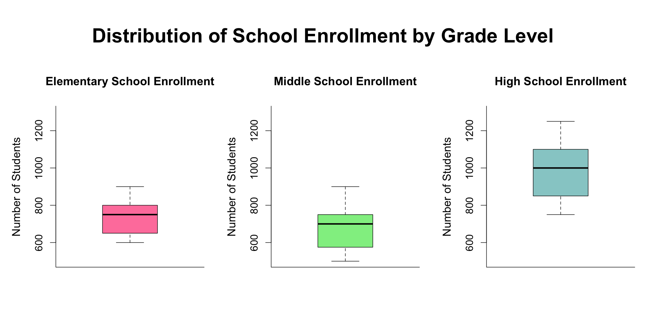
Separated the schools dataset into three different datasets being for elementary schools, middle schools, and high schools, given that these three are stored as three different variables in the housing dataset.

Combined the housing dataset by the elementary school dataset by elementary school names to create our first merged dataset.

Combined the first merged dataset with the middle school dataset by middle school names to create our second merged dataset.

Real Estate Market Patterns analysis visualization

Lastly, combined the second merged dataset with the high school dataset to create our final merged dataset that included all three grade levels with their assigned size and rating values.

The final merged dataset contained 635 rows and 21 columns. The merge process resulted in the addition of 6 new columns to the housing dataset, being size and rating variables for each of the three grade levels.

K-means Clustering:

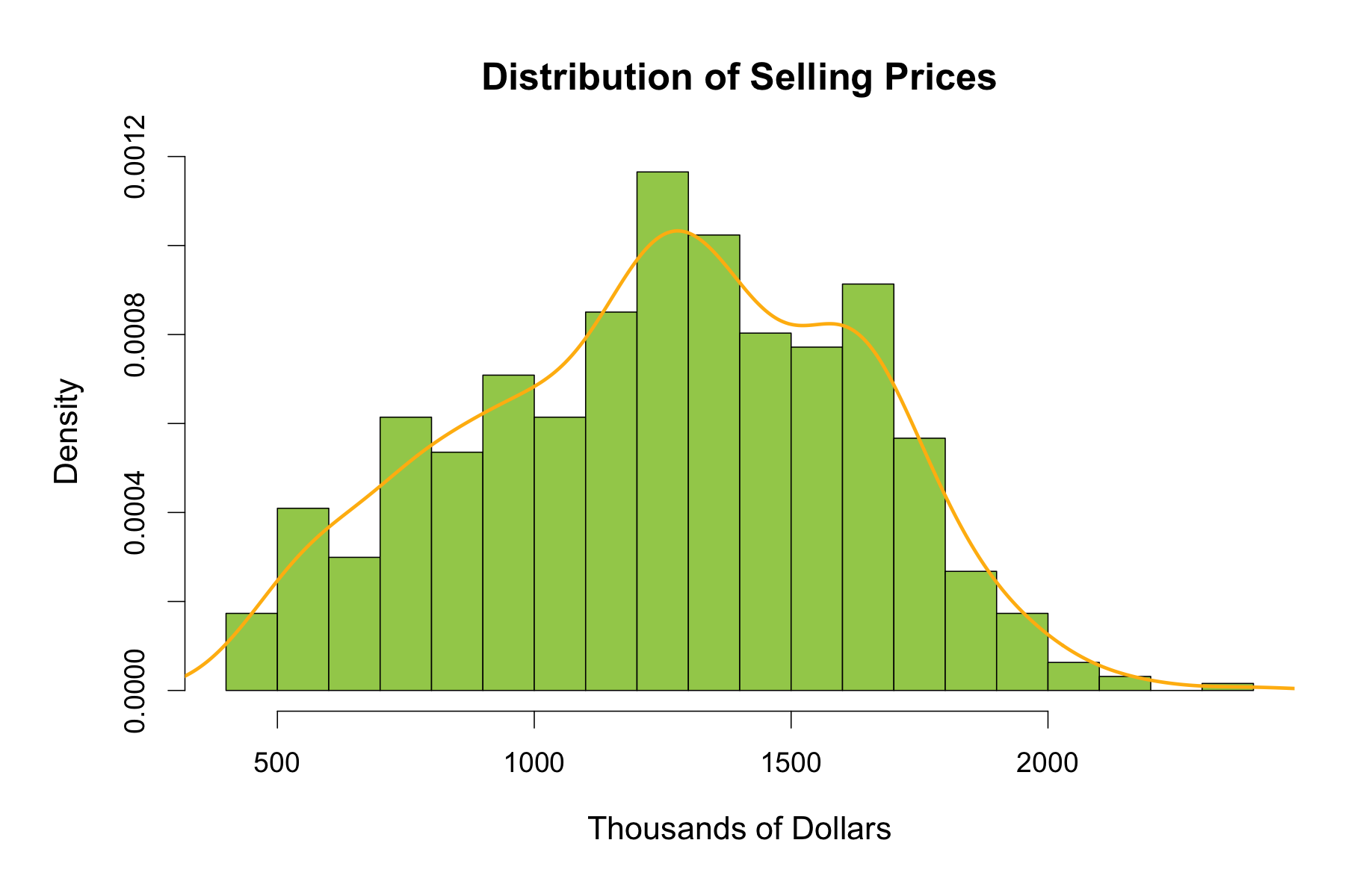
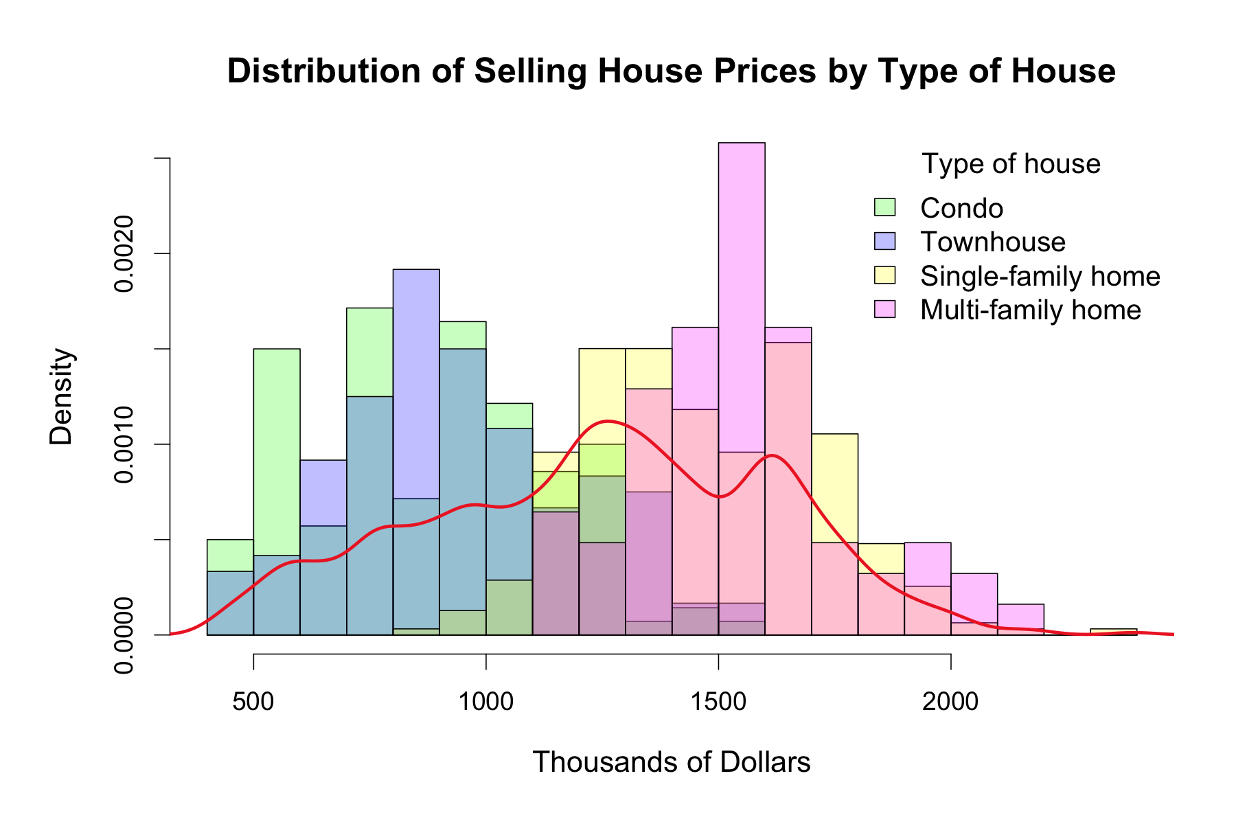
The histogram of Selling House Prices Separated by House Types reveals two peaks in the data, one around 800.000 dollars formed mostly by condos and townhouses, and a second larger peak around 1.500.000 dollars formed mostly by single and multi-family homes. It is clear from this graph that the 4 levels of the house type variable form 2 groups where condos and townhouses cluster together and single and multi family homes cluster together. Each of these two clusters appear to behave similarly in terms of Selling Prices.

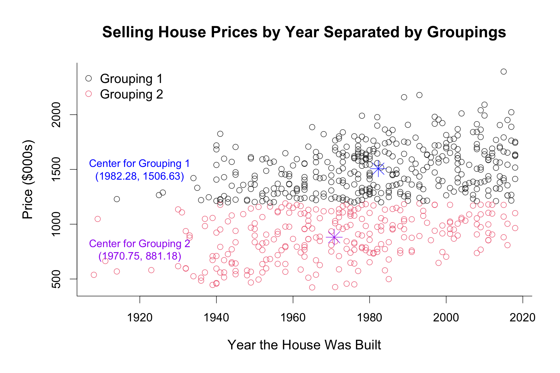
Given this visible separation, I performed a k-means clustering using Selling Price and Year variables, to separate the data into two groupings. Within the resulting two clusters, the center of Grouping 1 (1982.28 1506.63) was higher in both x and y values compared to the center of Grouping 2 (1970.75  881.18), indicating higher average values of Year and Selling Price for Grouping 1. I created a table to examine the distribution of house types across these groupings. The table showed that 88% of total single and multi-family homes belonged to grouping 1 whereas 83% of total condo and townhouses in our dataset belonged to Grouping 2. The results of this table affirms that the majority of condos and townhouses cluster together whereas the majority of single and multi family houses cluster together, despite some overlap between the two groupings.

Real Estate Market Patterns analysis visualization

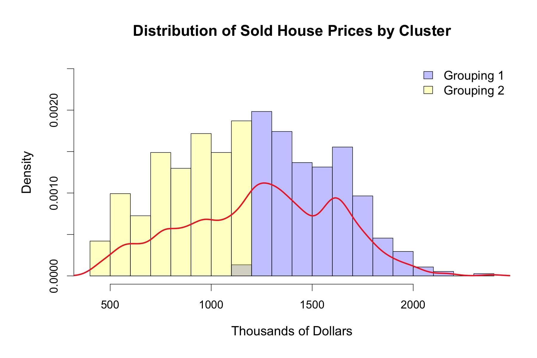
The following histogram is similar to the histogram above that illustrates the distribution of selling house prices, but is separated by the new cluster groupings instead of the original house type variables. There is a clear distinction between Grouping 1 and Grouping 2, where houses in Grouping 1 tend to almost exclusively sell for more than 1.200.000 dollars whereas houses in Grouping 2 sell for less than 1.200.000 dollars. This separation between the Groupings, although not as prominent, can also be observed in the above histogram of house types, where the portion of the histogram above this price point is mostly populated by single and multi-family homes, whereas below is populated by condos and townhouses.

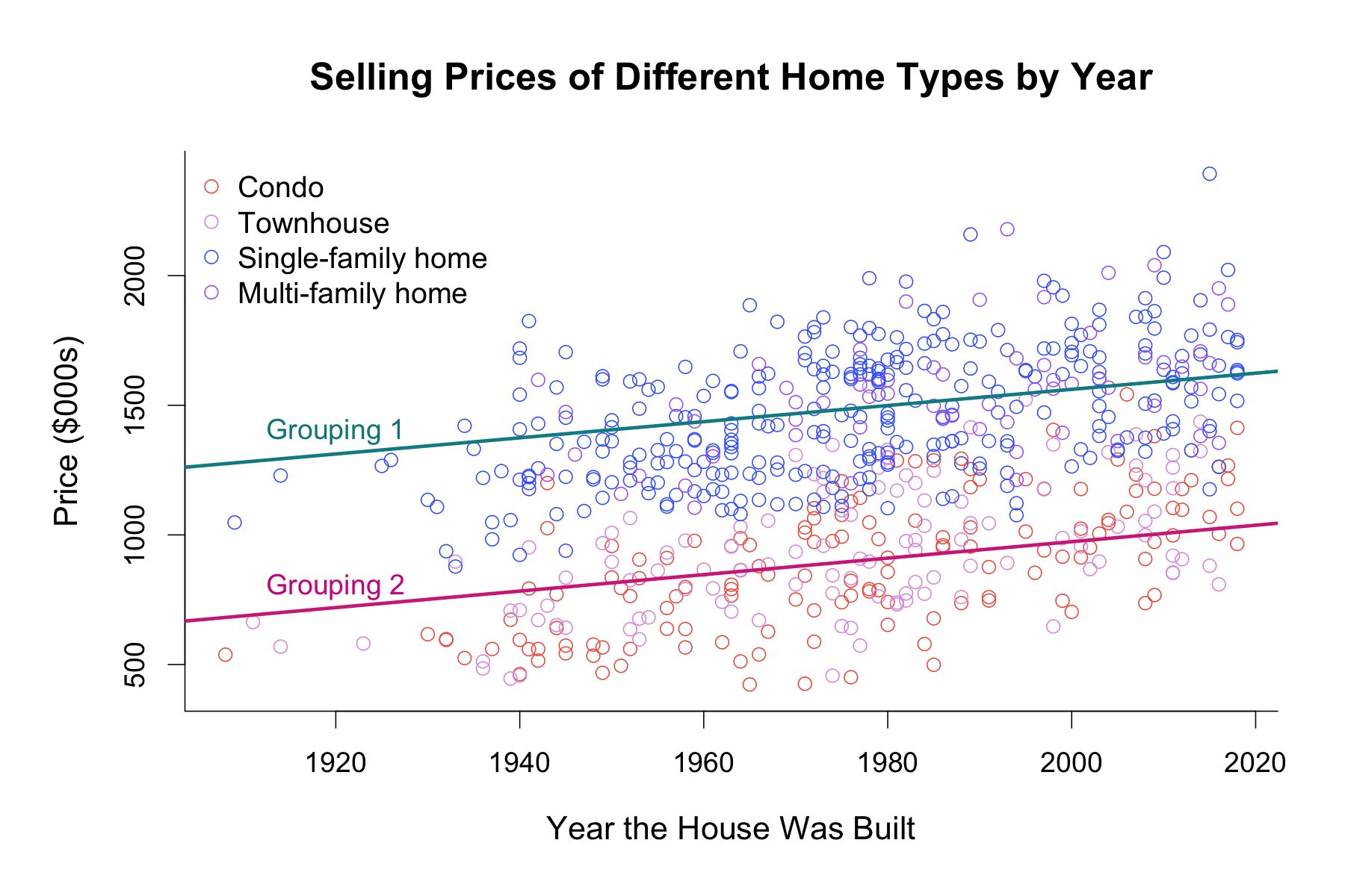
I then created a scatterplot of selling house prices by year, separated by our new groupings, demonstrating the center for each grouping. We can clearly see an increase in selling house prices for both groupings as the year increases, with prices for Grouping 1 being higher than Grouping 2 regardless of the year.

Regression Analyses:

Housing Dataset

I started out my regression analyses by investigating the correlations between the numerical variables in my merged dataset. I found that the beds, baths, square footage, and lot size variables were all highly correlated to each other, so I decided to only include one of these variables in my regression analysis to avoid multicollinearity. I chose the beds variable to include in the analysis given that it had the highest correlation to selling prices out of the 4 variables. Next, I conducted a backwards step function to discover which variables needed to be excluded from the model to decrease information loss. The resulting AIC (Akaike’s Information) values showed that excluding the cooling and levels variables from the model would lead to more accurate predictions of the selling prices. I did not include the size variables in the model, because school size was not found to be significantly correlated to selling prices. I attempted to include the school rating variables in the model, however, including these variables appeared to  reduce the significance of the other variables so I decided to explore them separately in the next section. My final selling price model included the following variables: neighborhood, type of house, heating, fireplace, year, and beds.

Real Estate Market Patterns analysis visualization

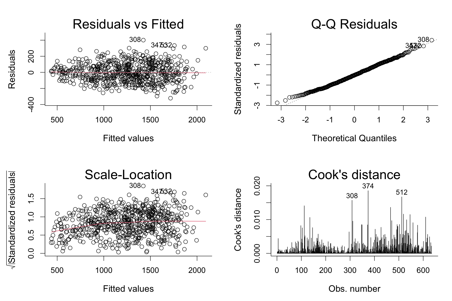
Almost all of our variable levels were found to be statistically significant in predicting selling house prices, except the Purple Neighborhood. Given the number of statistically significant independent variables in our model, it wasn’t surprising to see a high R-squared value of 0.90, meaning that 90% of the variation in the selling house prices could be explained by this model. Examining the diagnostic plots further demonstrates the goodness of our model. The Residuals vs. Fitted plot appears to follow a pretty strict horizontal line and the points seem to tightly follow the line on the Normal Q-Q Plot, indicating a pretty normal distribution. As seen in the Residuals vs. Leverage Plot, there were no high leverage observations in our model  that would skew the predictions.

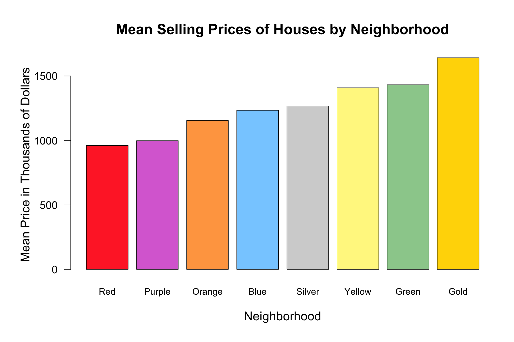
Looking more closely to our model, single-family homes seem to be correlated to the highest selling prices in our model, with multi-family homes being a close second. Moreover, as number of bedrooms in a house increase, the selling price increases, with a 82.37 thousand dollars increase for each additional bedroom. The presence of heating and fireplace in a house also seems to positively affect the selling prices. Lastly, we can see that the neighborhoods in an increasing order of selling price is as follows: Red, Purple, Orange, Blue, Silver, Yellow, Green, Gold.

Schools Dataset

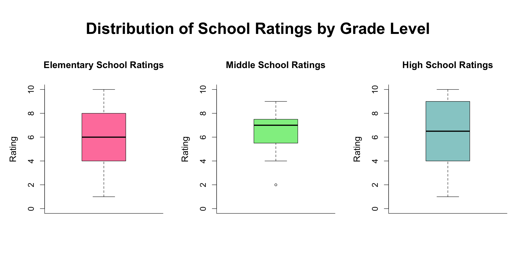
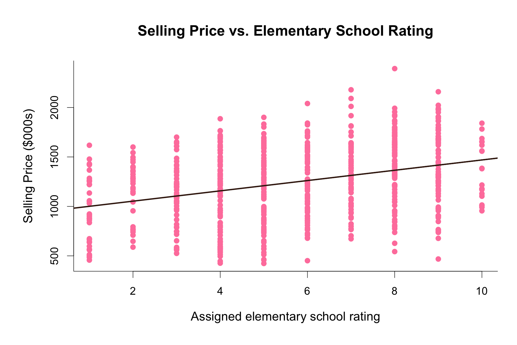
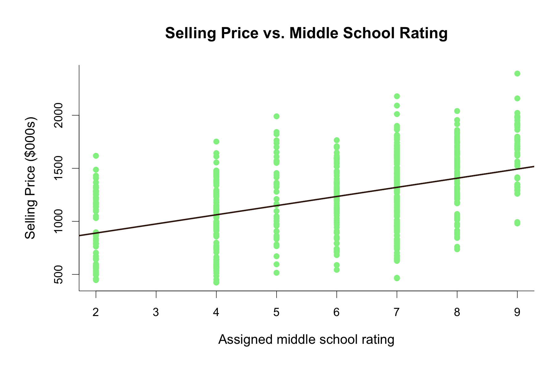
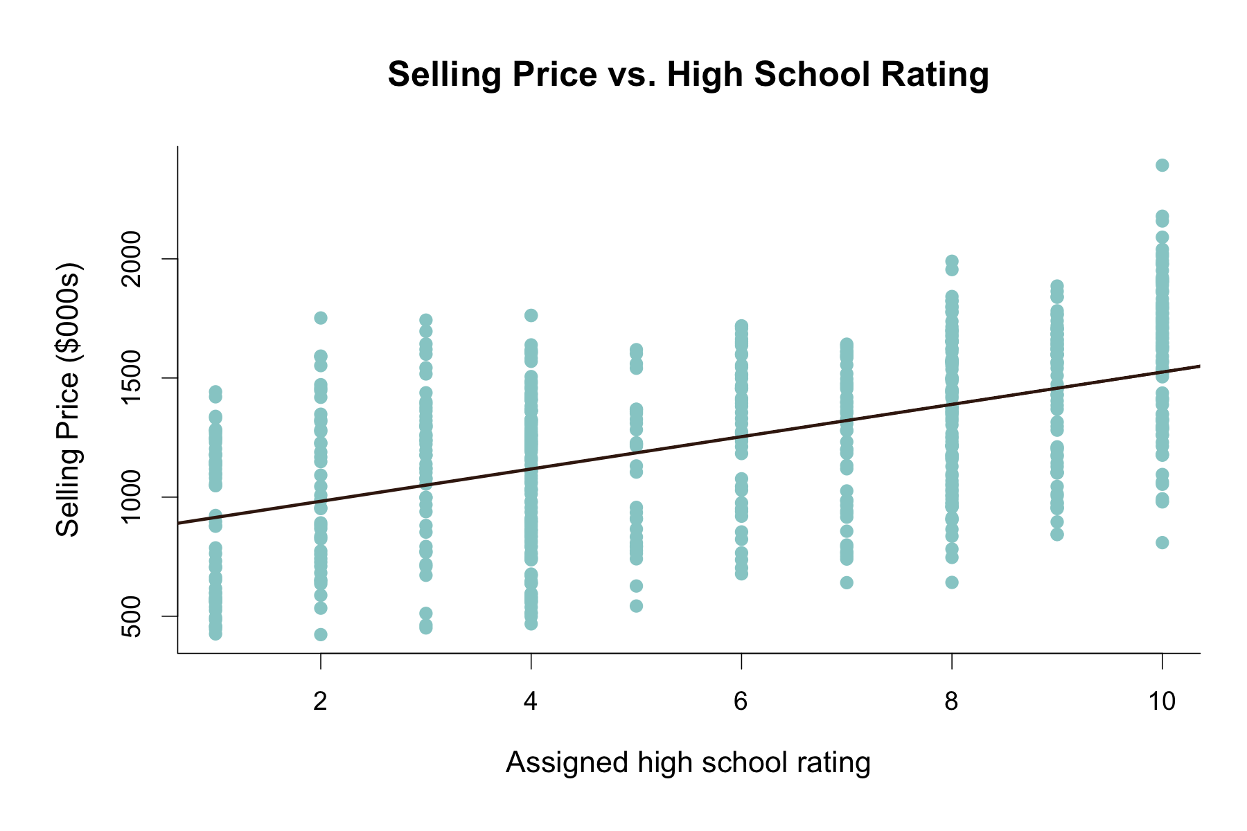
Since I wasn’t able to include school  ratings in my initial regression analysis, I decided to run  some additional analyses to investigate the relationship between selling prices and school ratings. Given that elementary, middle, and high school ratings were fairly correlated to each other, I ran separate regressions for each grade level. The below table gives a brief summary and comparison of these three regression models.

As the p-values indicate, all three variables were found to be statistically significantly correlated to house selling prices. We can see an increase in t-values and R-squared values as grade level increases. This increase indicates that assigned high school ratings are the better predictor of selling house prices in  the area, whereas the assigned elementary school ratings are the worse predictor of selling house prices in the area out of the three grade level variables. The higher R-squared value of the assigned high school rating variable means that a larger proportion of the variance in the selling price variable can be explained by the high school rating variable compared to middle and elementary school ratings.

Real Estate Market Patterns analysis visualization

Further Findings:

The bar plot of the mean selling prices by neighborhood graph further validates the neighborhood order in increasing selling prices. The top three most expensive neighborhoods seem to be the Gold, Green, and Yellow neighborhoods, whereas red and purple neighborhoods appear to be the cheapest neighborhoods for house prices.

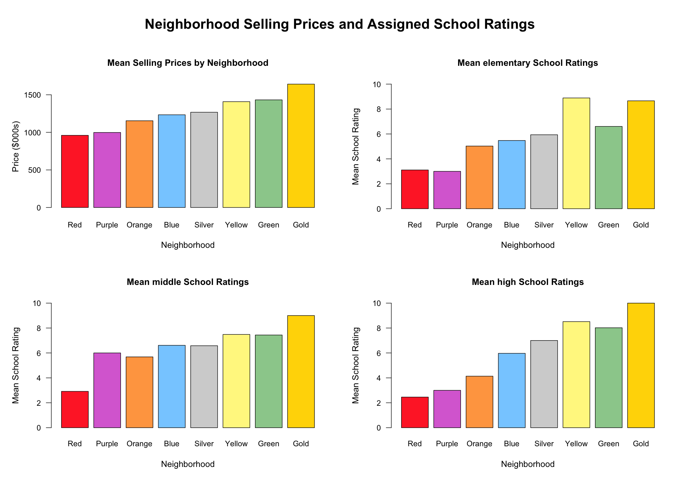
I wanted to compare the selling house prices of different neighborhoods to the ratings of elementary, middle, and high school that are assigned to these neighborhoods to see if there are any patterns. In the below bar plots that illustrates this comparison, the selling price by neighborhood plot has been highlighted for reference and to distinguish from school rating by neighborhood plots. In the rating plots, we can observe similar patterns to the selling price plot, where there is a general increase from the red neighborhood to the gold neighborhood, with slight deviations. The school rating plot that most closely follows the pattern of the selling price plot seems to be the one for high school ratings, which is in line with our regression results from earlier showing that high school ratings were the better predictor of selling house prices compared to middle and elementary school ratings.

I wanted to compare the selling house prices of different neighborhoods to the ratings of elementary, middle, and high school that are assigned to these neighborhoods to see if there are any patterns. In the below bar plots that illustrates this comparison, the selling price by neighborhood plot has been highlighted for reference and to distinguish from school rating by neighborhood plots. In the rating plots, we can observe similar patterns to the selling price plot, where there is a general increase from the red neighborhood to the gold neighborhood, with slight deviations. The school rating plot that most closely follows the pattern of the selling price plot seems to be the one for high school ratings, which is in line with our regression results from earlier showing that high school ratings were the better predictor of selling house prices compared to middle and elementary school ratings.

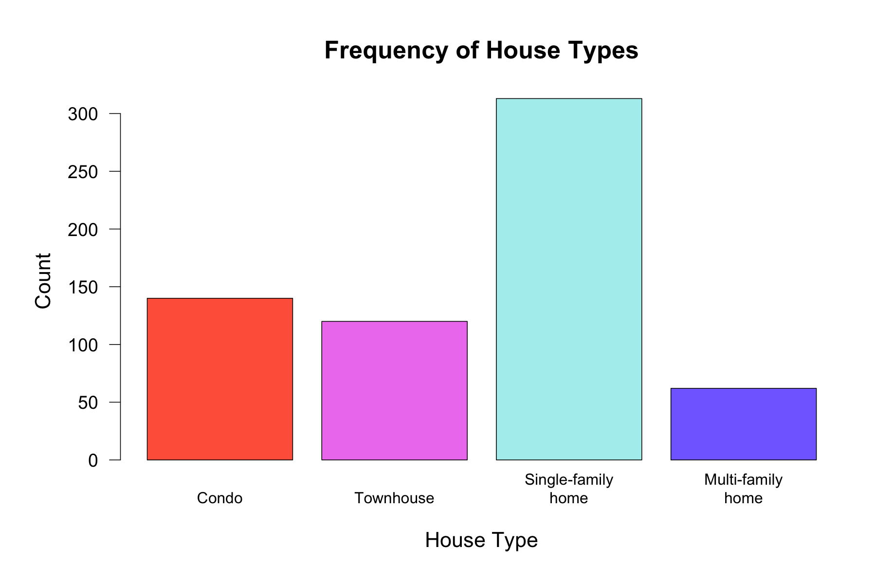
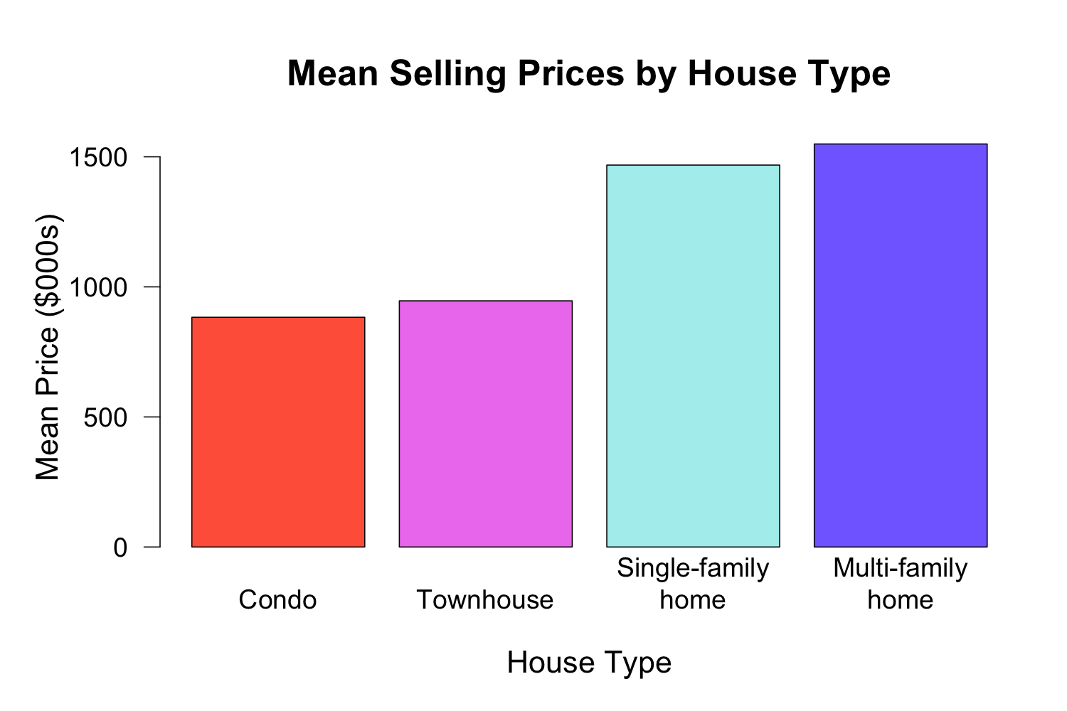
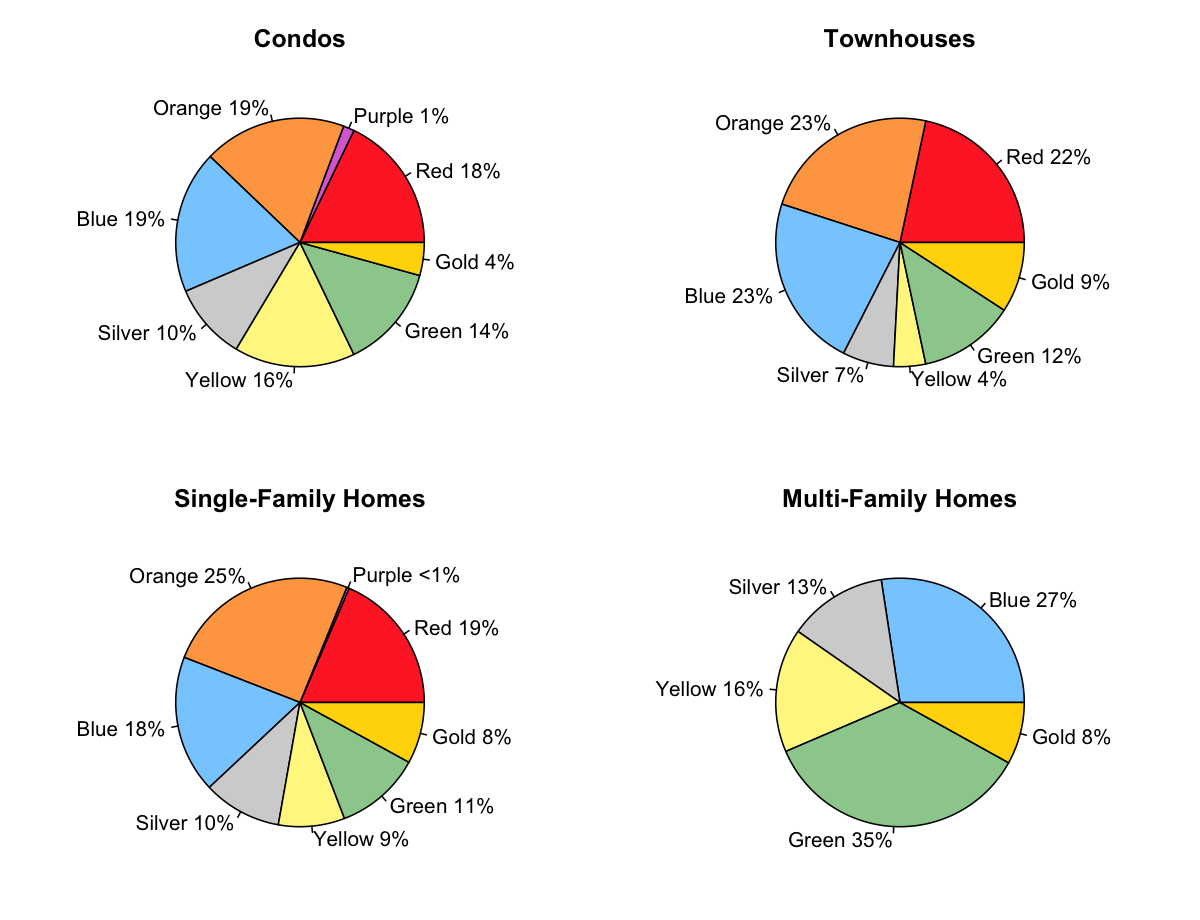
The above bar plots on selling prices by neighborhoods and house types made me curious as to whether there was a relationship between neighborhoods and house types. I created the above pie charts for each house type to illustrate the proportions of their prevalence in different neighborhoods. Although the pie charts for condos, townhouses, and single-family houses appear fairly similar at first look, the pie chart for multi-family houses look different. It appears that multi-family homes are more selectively distributed across neighborhoods, and are only found in the top 5 most expensive neighborhoods. This makes sense since the multi-family homes were also shown to be the most expensive house type in a previous bar plot. Although it was expected to observe a similar distribution for condos and townhouse due to similar mean price points, it was interesting to see that the distribution of single-family homes was also very similar to that of condos and townhouses, given that selling prices for single-family homes were more similar to that for the multi-family homes.

Real Estate Market Patterns analysis visualization

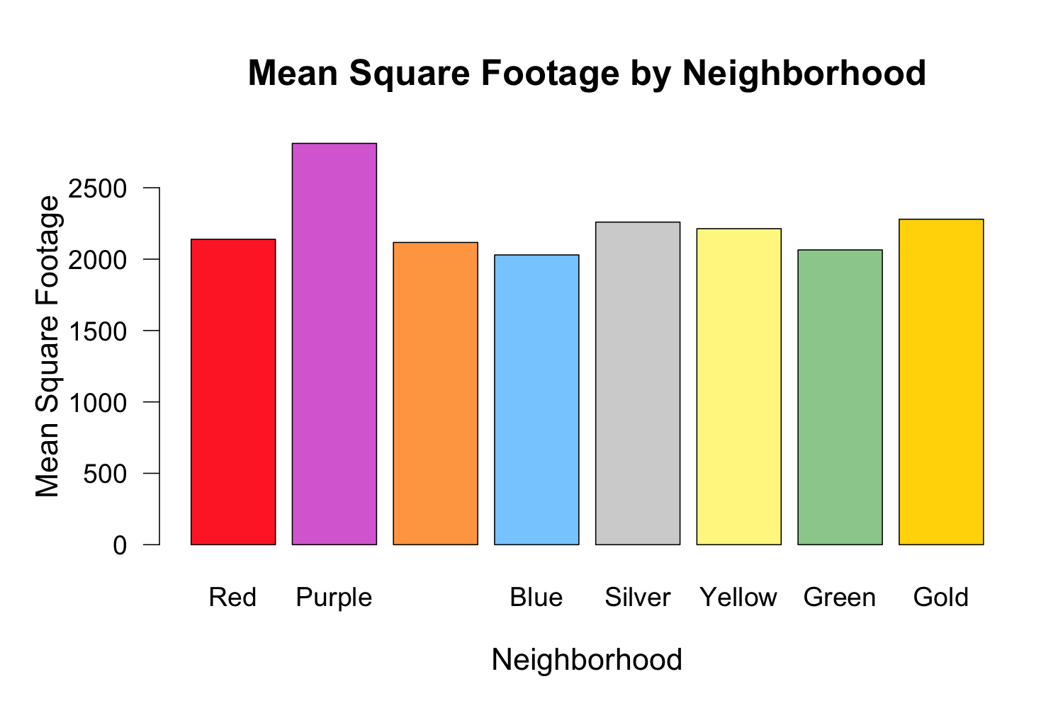
Moreover, the bar graph of square footage by neighborhood caught my attention. The purple neighborhood seemed to have the highest mean square footage out of all neighborhoods, while the rest of the neighborhoods did not seem to differ from each other significantly. This was surprising to see due to the purple neighborhood having the second lowest mean selling price. This finding could indicate that purple neighborhood might be the best area to find houses with the highest square footage per price. Families with a lower budget that require a larger living space could benefit from house-searching in this particular area.

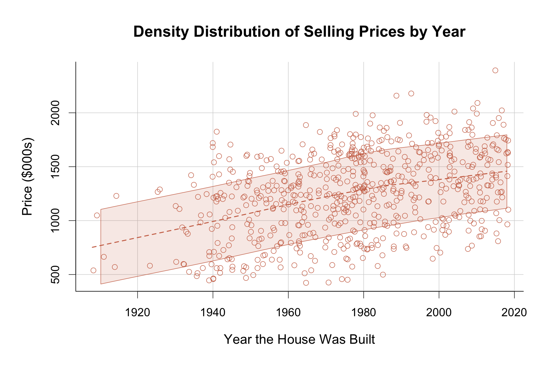
Next, I looked at a density plot of selling house prices by year. We can see a clear increase in selling prices as the year variable increases. This means that the more recently a house was built, the more expensive it’s selling price will be.

To dig deeper into this scatterplot, I separated the points by the original house type variable. As we can see from the scatterplot below, although there is a steady increase in selling price for all levels as year increases, condos and townhouses populate the lower part of the plot while the single and multi-family homes populate the higher portion of the plot. We saw this same effect earlier in our cluster analysis where Grouping one populated the higher portion of the graph while Grouping 2 populated the lower portion. I added the regression lines for the cluster groupings onto the same scatterplot to observe this effect more in depth. It is clear that Grouping 1 corresponds more closely to single and multi-family homes whereas Grouping 2 corresponds more closely to condos and townhouses. The slopes for the grouping models are extremely similar but their intercept differs significantly. This indicates that although there is a significant selling price difference between the two groups, both models increase similarly as year increases.

Conclusions and Recommendations:

Our analyses revealed the order of the neighborhoods in increasing selling prices as follows: Red, Purple, Orange, Blue, Silver, Yellow, Green, Gold. Moreover, single and multi-family houses were found to be more expensive compared to condos and townhouses, despite there being no significant differences in square footage or lot size. According to our regression analysis, the presence of a heating system as well as a fireplace was found to be positively correlated to higher selling prices. The prices also increased as the number of bedrooms and bathrooms increased. The more recently built houses tended to be more expensive than older houses. One recommendation for the housing organization would be to buy houses for more affordable prices in some of the cheaper neighborhoods, improve the houses by adding a heating system or fireplace, and resell the house for a higher price.

Real Estate Market Patterns analysis visualization

Moreover, the selling prices and school ratings bar plots suggests that the Yellow neighborhood might be an area with potential growth. Although it is third on the list for selling prices, it has the highest elementary school ratings of all neighborhoods. Yellow neighborhood can be recommended for parents with younger kids, who might not be able to afford houses in the top two neighborhoods, but still view education as one of their top priorities when looking for housing.

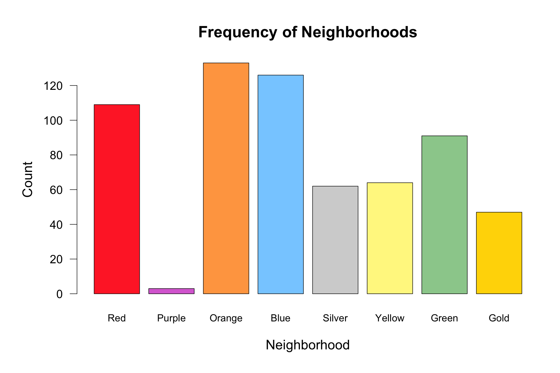
Furthermore, more data needs to be collected from the Purple neighborhood to investigate whether this area might really be the best area to get the most affordable price per square footage. In our current dataset there were only 3 observations that belonged to this neighborhood, which decreases confidence in findings related to this specific area. A bigger sample size is necessary to further investigate the relationship between square footage and selling prices in the purple neighborhood.

Real Estate Market Patterns analysis visualization

Real Estate Market Patterns analysis visualization

Real Estate Market Patterns analysis visualization

Real Estate Market Patterns analysis visualization

Real Estate Market Patterns analysis visualization

Real Estate Market Patterns analysis visualization