Ece Erke/Data Analyst
← Back to portfolio

Tableau · Geospatial analysis · ACLED data

Global Protest Monitor

An interactive Tableau experience that maps protest intensity, geographic concentration, and observed severity across 209 countries.

Project brief

01

Question

Where is recorded protest activity concentrated, how is it changing, and what explains differences in observed severity?

02

Data

232,507 ACLED protest-event records across 209 countries, from January 1, 2024 through July 24, 2025.

03

Method

Geospatial exploration, temporal comparison, country drilldown, and a transparent descriptive severity index.

Explore the experience

From global scan to country-level context.

Global view

See the global pattern first.

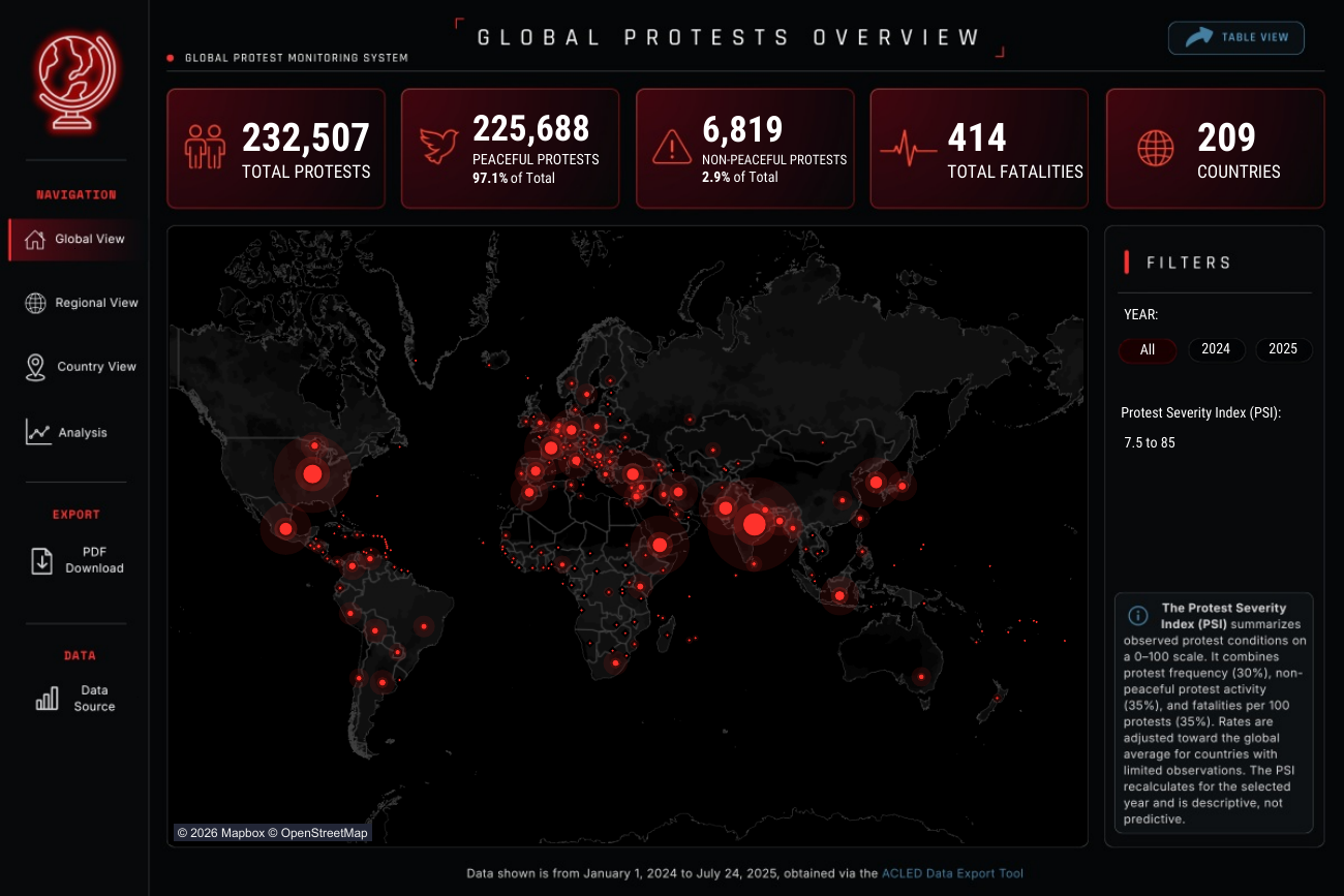
The map plots recorded protest-event locations and scales the circles by activity, while the KPI row keeps total protests, peaceful and non-peaceful events, reported fatalities, and country coverage in view.

ControlsUse the Year buttons to compare 2024 with 2025, or narrow the display with the Protest Severity Index range control. 2025 is partial: it includes records from January 1 through July 24 only.

Open the live dashboard ↗
Global view from the Global Protest Monitor dashboard

Regional view

Compare regional context.

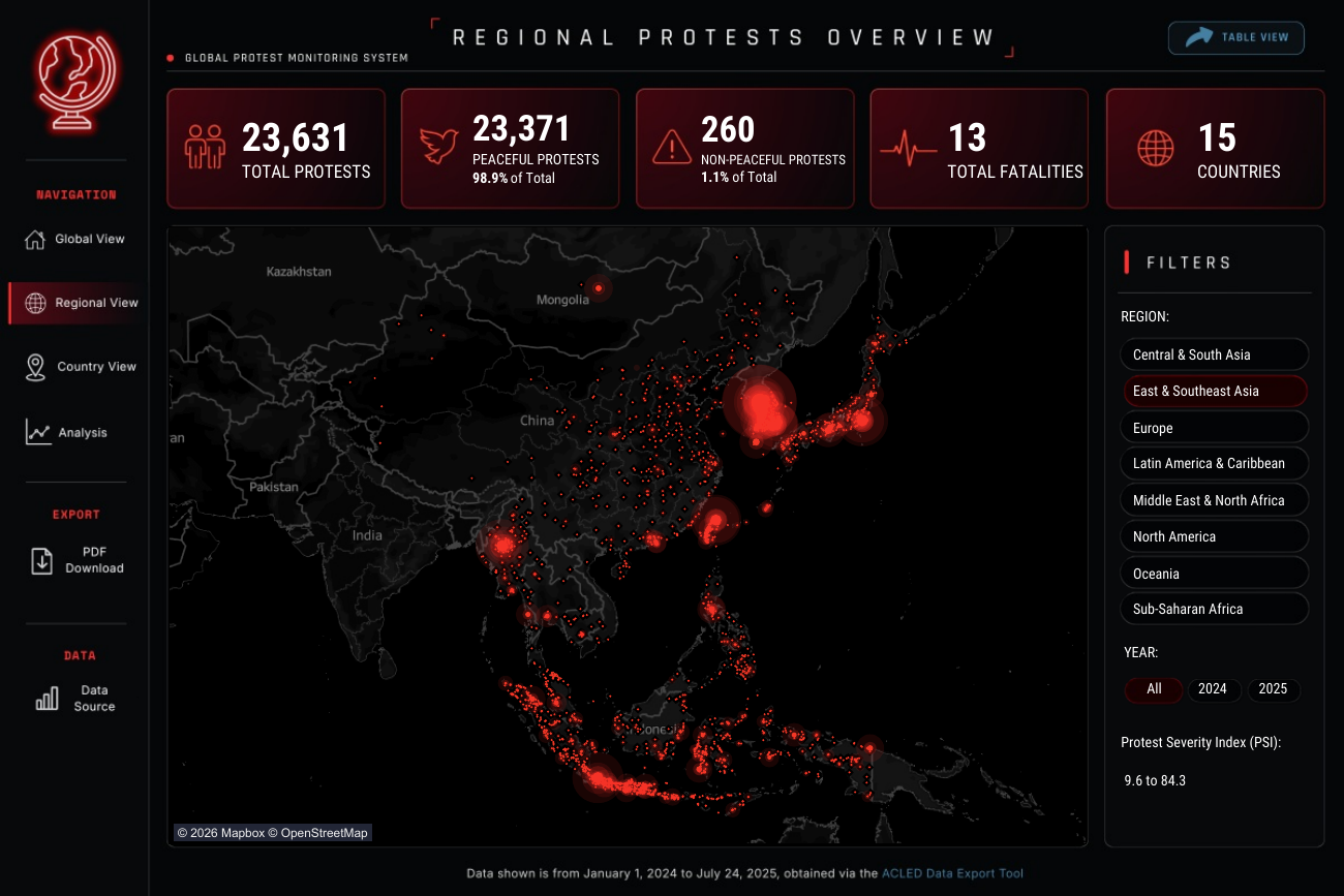
The regional map applies the same event-location view to a selected region, so geographic patterns can be examined without losing the summary measures for activity, peacefulness, fatalities, and countries represented.

ControlsChoose a region, select a year, and refine the display with the PSI range control. As with the Global View, the 2025 option covers January 1 through July 24 only.

Regional view from the Global Protest Monitor dashboard

Country view · Protest activity

Compare activity and geographic reach.

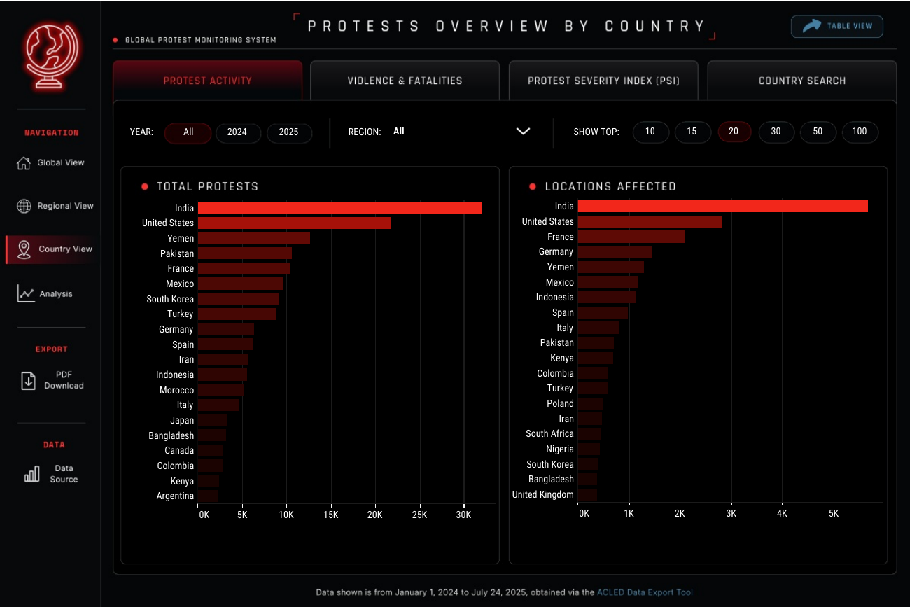
Two ranked bar charts show total recorded protests and locations affected across countries. Reading them together distinguishes countries with high event volume from those where activity is spread across more places.

ControlsFilter by year or region, then use Show Top to set the number of countries displayed. This is an exploratory comparison view, not an individual country drilldown.

Country view · Violence & fatalities

Read fatalities alongside peacefulness composition.

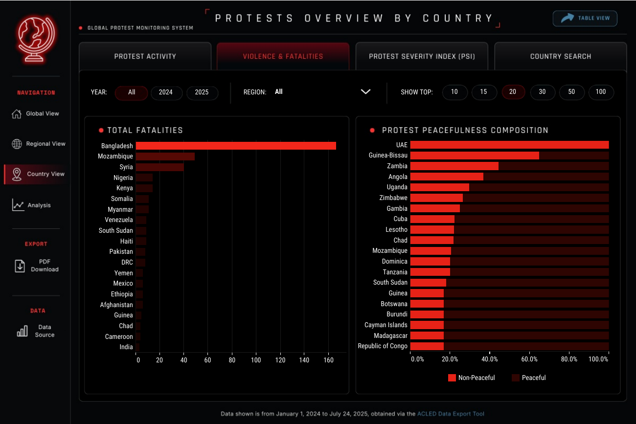
The left ranking shows reported fatalities by country. The right stacked bars show the proportion of recorded protest events classified as non-peaceful or peaceful, making event character visible separately from fatality counts.

ControlsFilter by year or region and adjust Show Top to focus the ranked comparison. Reported fatalities are observational data and should be interpreted with coverage and coding differences in mind.

Country view · Protest Severity Index

Break the PSI into its three components.

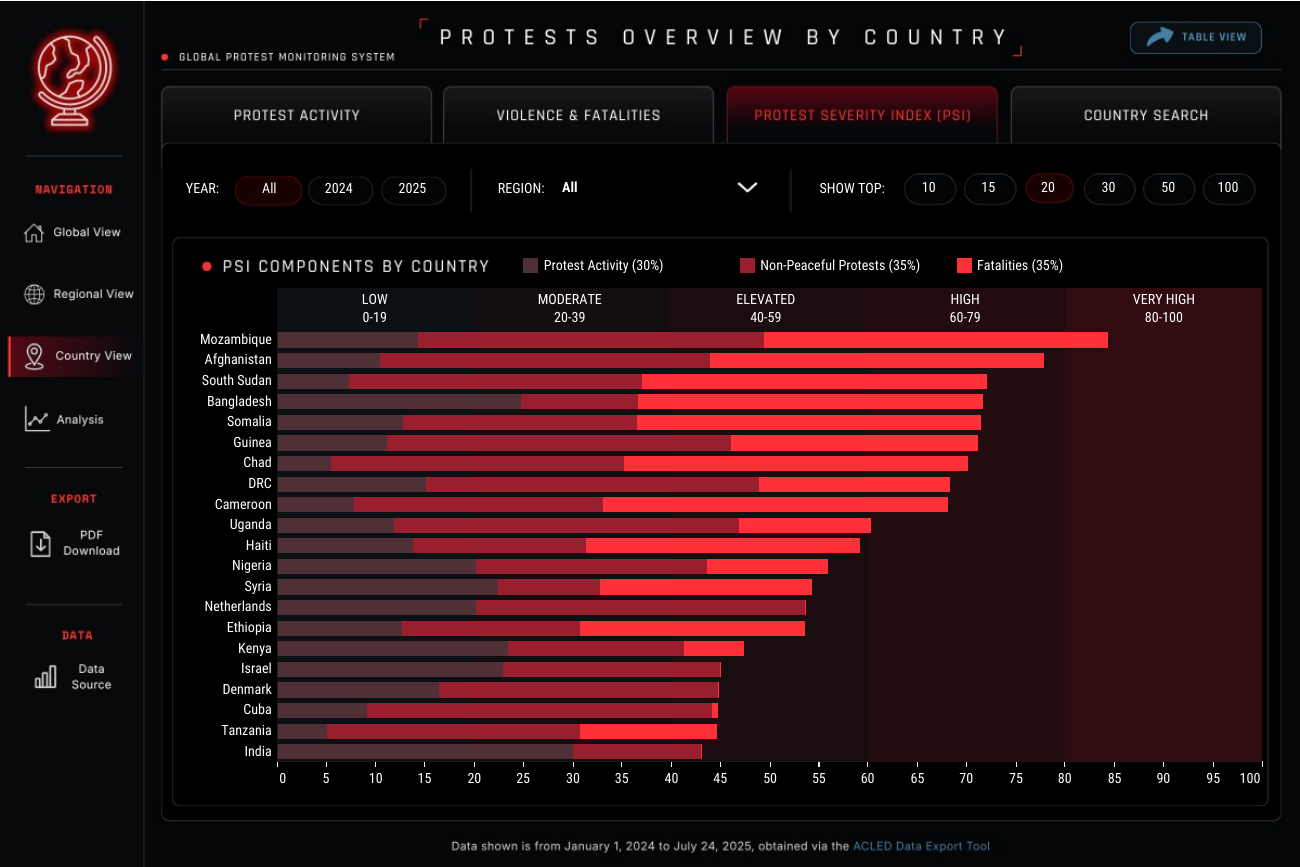
Each stacked bar shows how activity, non-peaceful protest share, and reported fatalities contribute to a country’s descriptive PSI. The background bands provide the Low-to-Very High score ranges, so the score is interpretable rather than a black box.

How PSI is constructedActivity contributes 30%; non-peaceful share and reported fatalities each contribute 35%. Rates are smoothed toward the global rate where country event counts are limited, reducing the influence of small samples. PSI describes the observed period; it does not explain cause or forecast unrest.

Country view · Country search

Use the dashboard as an investigation tool.

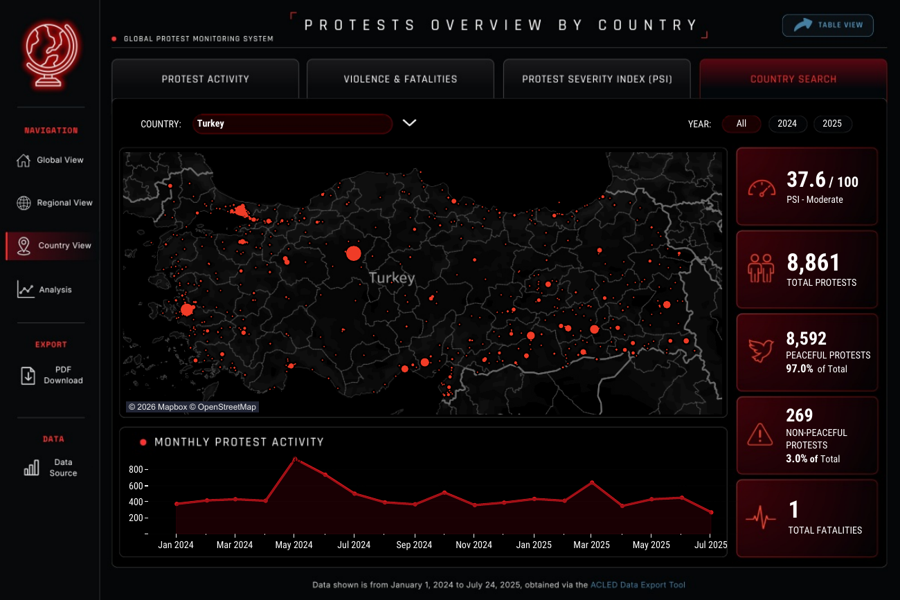
Country Search combines a selected country’s event-location map, monthly activity line, and headline measures. It is the focused entry point for moving from the cross-country comparisons to an individual country and period.

ControlsSelect a country and year, then read the map and monthly line together. The Turkey display is an interaction example, not a conclusion about the country.

1 / 4

Protest activity from the Global Protest Monitor Country ViewViolence & fatalities from the Global Protest Monitor Country ViewProtest Severity Index from the Global Protest Monitor Country ViewCountry search from the Global Protest Monitor Country View

Analysis

Three lenses for explaining the pattern.

These views turn the dashboard from a map into an analytical project: they test momentum, concentration, and the observable drivers behind a country’s severity profile.

01 · Trends & momentum

Read change in context.

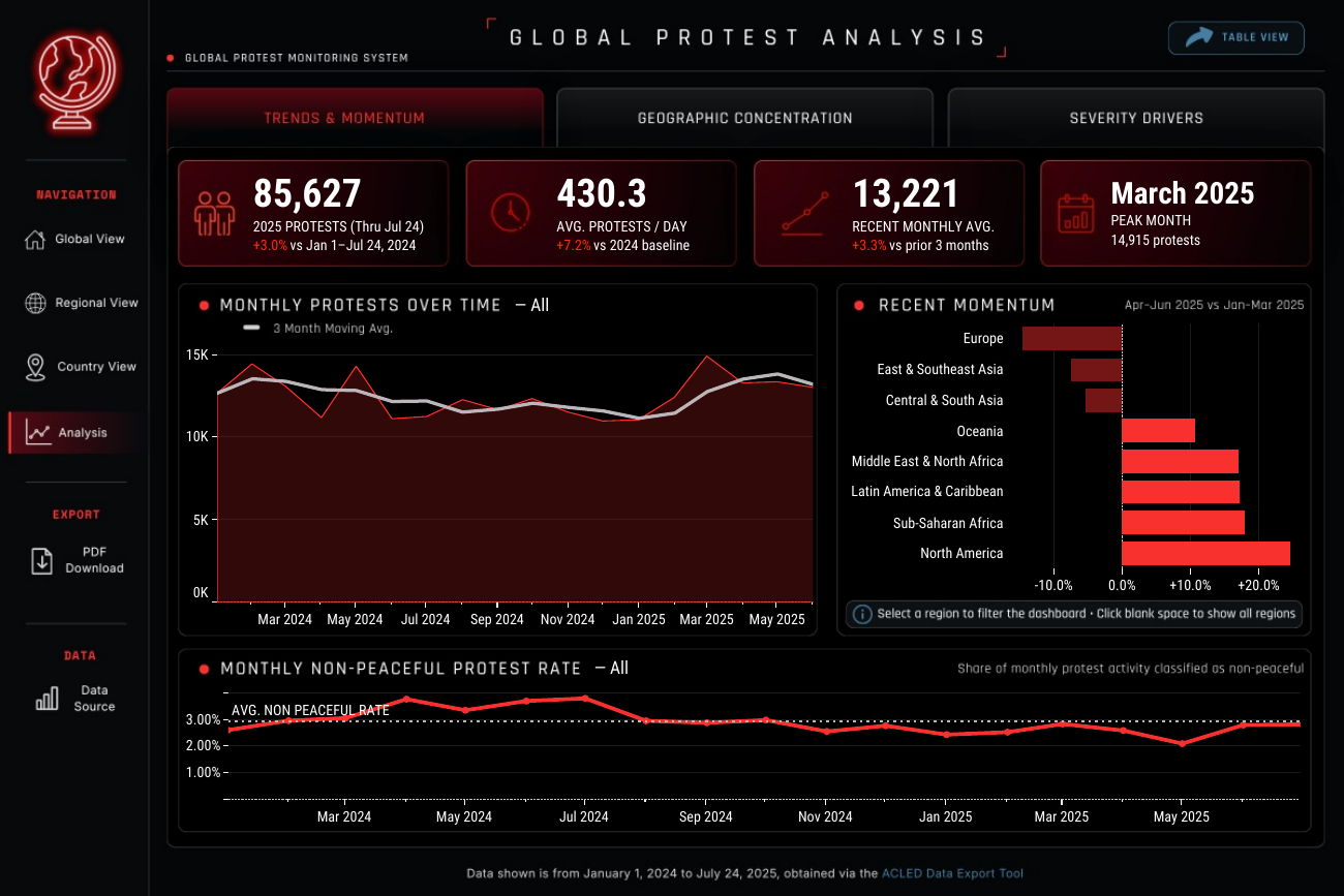
This view asks whether recorded activity is merely volatile or actually shifting. The top line chart shows the total number of protest events recorded each month; the lighter line is the three-month moving average.

How to read it

Each moving-average point averages the current month and the prior two months. That smoothing reduces the visual weight of one-off peaks while retaining the underlying monthly series. The regional bars compare Apr–Jun 2025 with Jan–Mar 2025, turning “recent momentum” into a stated period-over-period calculation.

FindingMarch 2025 was the period peak, with 14,915 recorded protests.

Trends & momentum analysis from the Global Protest Monitor dashboard

02 · Geographic concentration

Test whether activity is concentrated or widespread.

This view separates the volume of recorded protests from their geographic reach. The scatterplot places each country by total protest events and distinct locations affected; the Pareto chart ranks countries and accumulates their share of all recorded activity.

How to read it

Both scatterplot axes use logarithmic scales. That keeps lower-volume countries readable instead of compressing them against the origin, while the Pareto thresholds show exactly how quickly activity concentrates as countries are added by rank.

FindingNine countries account for half of recorded activity; India has the widest spread, across 5,664 locations.

Geographic concentration analysis from the Global Protest Monitor dashboard

03 · Severity drivers

Unpack the score behind the signal.

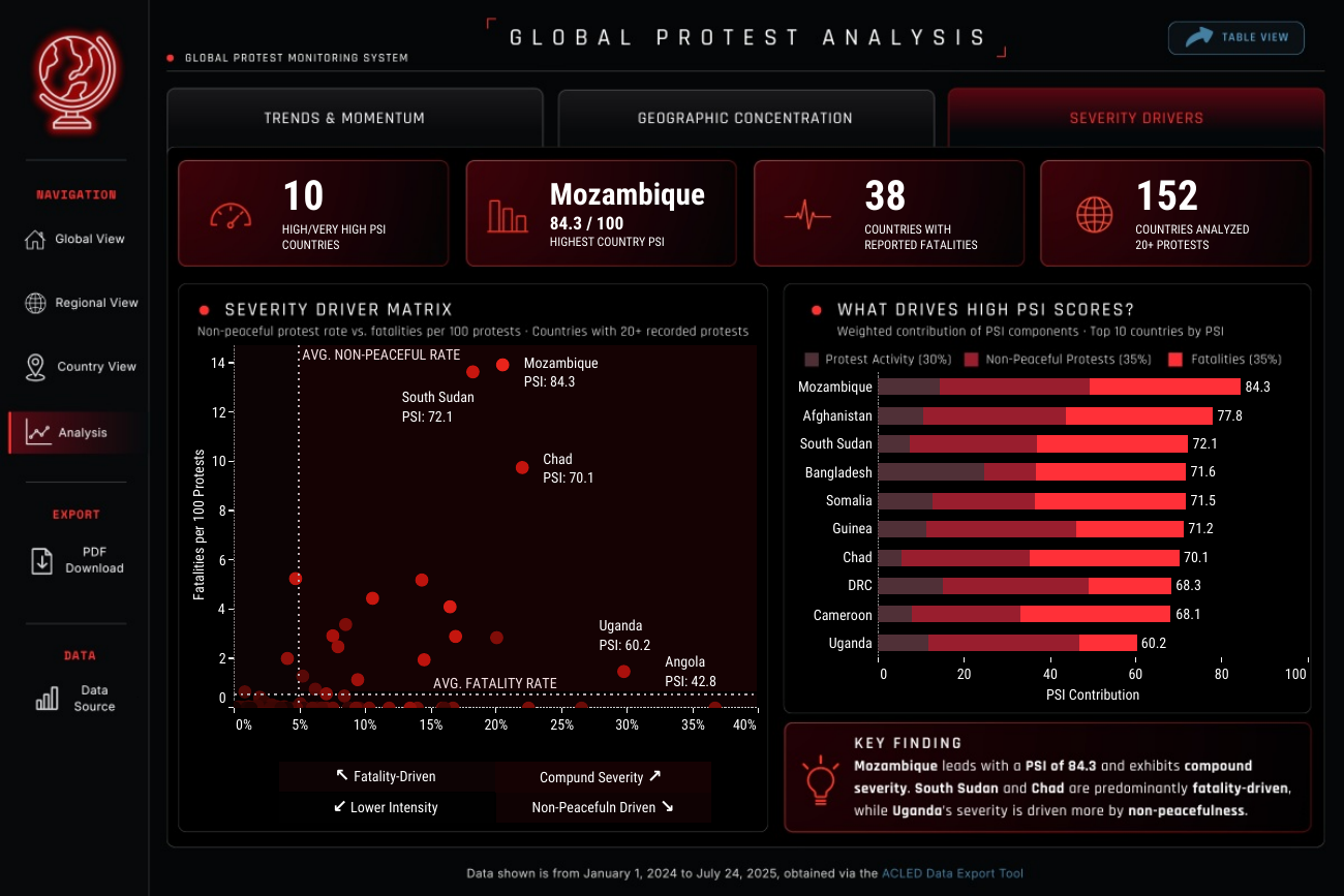
This view makes the Protest Severity Index inspectable. The driver matrix positions countries by their non-peaceful protest share and reported fatalities per 100 protests; stacked bars show the activity, non-peaceful, and fatality contributions to each final PSI.

How to read it

The analysis excludes countries with fewer than 20 recorded protests from the driver matrix, so a very small number of events cannot dominate the comparison. PSI combines normalized activity (30%), smoothed non-peaceful share (35%), and smoothed fatality rate (35%); it describes the observed period rather than predicting unrest.

FindingCountries can have similar PSI scores for different reasons—Mozambique is highest at 84.3, while South Sudan and Chad are more fatality-driven and Uganda is more influenced by non-peaceful activity.

Severity drivers analysis from the Global Protest Monitor dashboard

Methodology

A severity measure that makes its assumptions visible.

The Protest Severity Index (PSI) compares the observed severity profile of country-level protest activity. It is designed for exploration and comparison—not prediction.

01 · Dataset & scope

Use a consistent event-level base.

The analysis uses 232,507 ACLED records classified as protest events, covering January 1, 2024 through July 24, 2025 across 209 countries. Counts refer to recorded events—not participants, unique movements, or an estimate of all protest activity.

02 · Comparative choices

Compare like with like.

Monthly totals provide the time series; a three-month moving average makes short-term volatility easier to read. Country and regional comparisons use rates alongside totals, and the geographic scatterplot uses logarithmic scales so lower-volume countries remain visible.

03 · Interpretation safeguards

Keep observed data in context.

2025 is a partial year, so recent movement is shown against comparable 2024 dates. Reported fatalities and event classifications can vary with coverage and coding; the analysis therefore describes observed patterns rather than assigning causes or forecasting unrest.

PSI

30% activity + 35% non-peaceful share + 35% reported fatalities

Activity is normalized by observed months and capped on a logarithmic scale. Non-peaceful share and fatalities are expressed as rates. For countries with limited recorded events, those two rate-based components are smoothed toward the global rate using a 50-event factor.

This reduces the chance that a small number of records creates an extreme score. Scores are scaled 0–100 and grouped as Low, Moderate, Elevated, High, and Very High.

Read the PSI calculation and safeguards

The final calculation is 0.30 × activity + 0.35 × non-peaceful share + 0.35 × fatality score. The labels and bands describe this observed dataset and period; they do not indicate cause or predict future unrest.

Read the data transformations and groupings

Event classification. The source records are protest events. For this project, Peaceful is a record whose sub_event_type is “Peaceful protest”; other non-null sub-event types are grouped as Non-Peaceful, and null values remain Unknown.

Project-defined regions. ACLED’s regional values are consolidated for comparison: Central America, South America, and the Caribbean become Latin America & Caribbean; Eastern, Middle, Southern, and Western Africa become Sub-Saharan Africa; Middle East and Northern Africa become Middle East & North Africa; Caucasus & Central Asia and South Asia become Central & South Asia; and East Asia and Southeast Asia become East & Southeast Asia. North America, Europe, Oceania, and Antarctica (shown as Oceania) remain separate.

Derived comparisons. The dashboard aggregates records into event counts, distinct locations affected, monthly totals, peacefulness shares, and reported fatalities per 100 protests. It uses a three-month moving average, comparable 2025-versus-2024 dates, Pareto cumulative shares for the 50% and 80% concentration thresholds, and logarithmic scales in the geographic scatterplot. Country labels are displayed as supplied, except “Democratic Republic of Congo,” which is shortened to “DRC.”

Original analytical choices. “Recent momentum” compares the latest three complete months with the preceding three complete months. The PSI driver matrix requires at least 20 recorded protests; its rate components use the 50-event smoothing factor described above. These transformations and the PSI are original project choices, not ACLED classifications or forecasts.
Interpret with care

Recorded events are not the same as lived reality.

ACLED data is observational: reporting coverage, event coding, and fatality reporting may vary by place and over time. The dashboard therefore uses “recorded” activity and “reported” fatalities throughout, keeps the partial 2025 end date visible, and treats PSI as a descriptive comparison aid.

Data source: ACLED (Armed Conflict Location & Event Data), accessed 25 July 2025. This project uses records classified as protest events from 1 Jan 2024–24 Jul 2025 across 209 countries. Records were aggregated for descriptive geographic and temporal analysis; PSI is an original, non-predictive composite created for this project. Terms & attribution · Navigation inspiration: Asha Daniels’ World Literacy Rates Overview